Design Objective: Pick a topic relating to graphic design or technology and write an article about it. Find an online article relating to some aspect of your topic and extract a portion of it to use as a sidebar article in the layout. Design a 6-page layout around the article that fits the theme of it, including a title, sidebar article, pictures, and page numbers. Incorporate interactive elements into the layout. Design a cover for the magazine that this article would appear in.
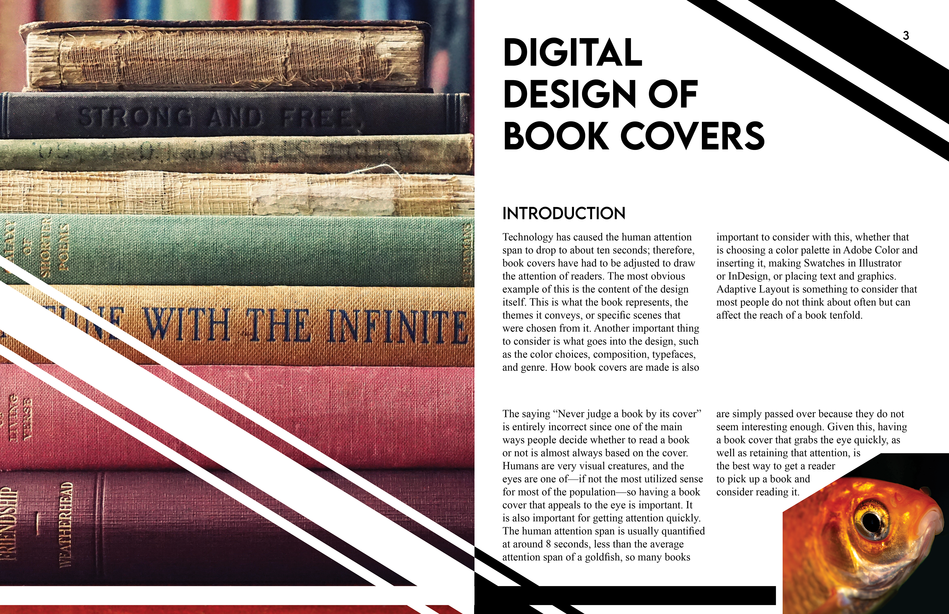
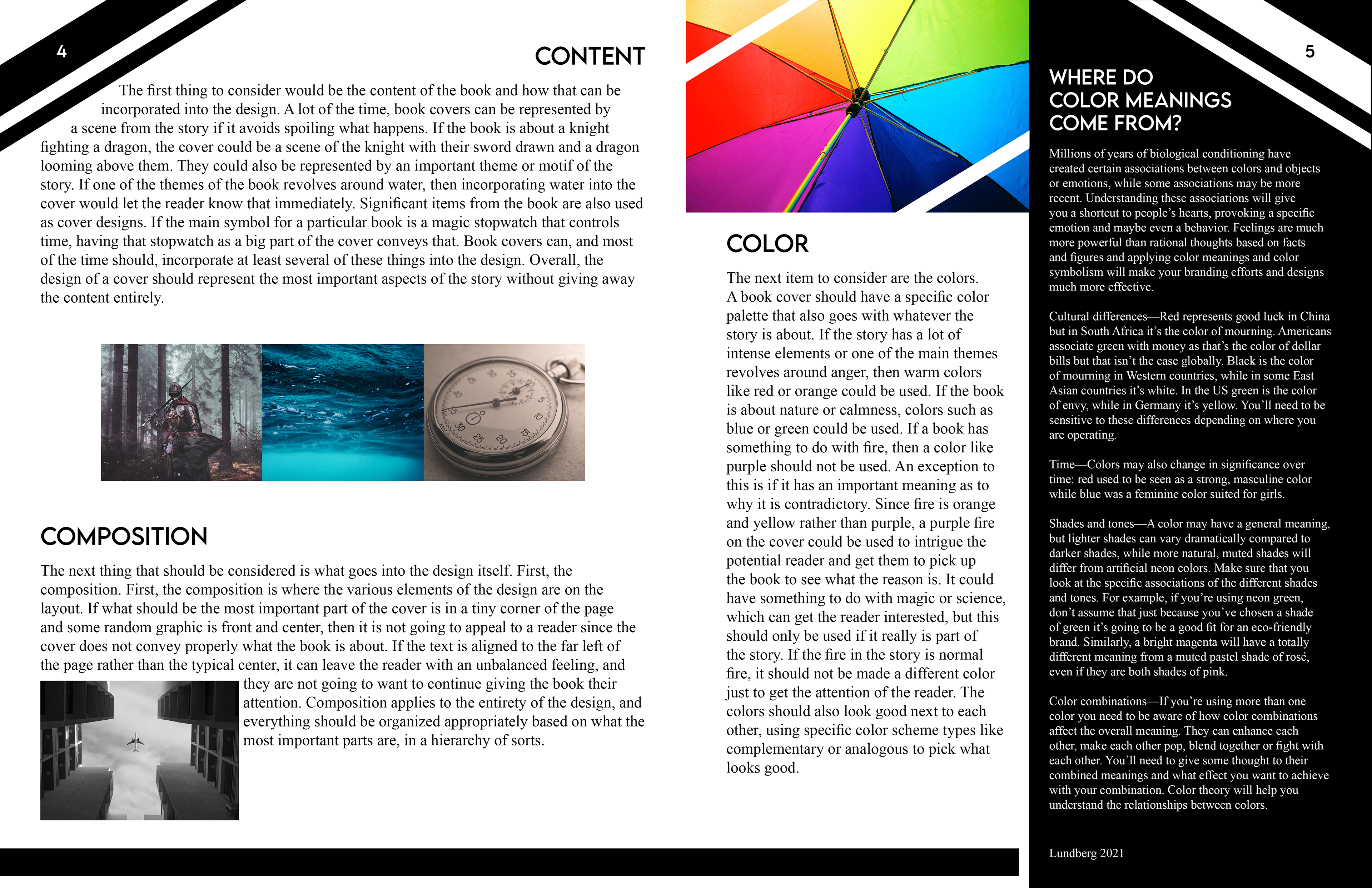
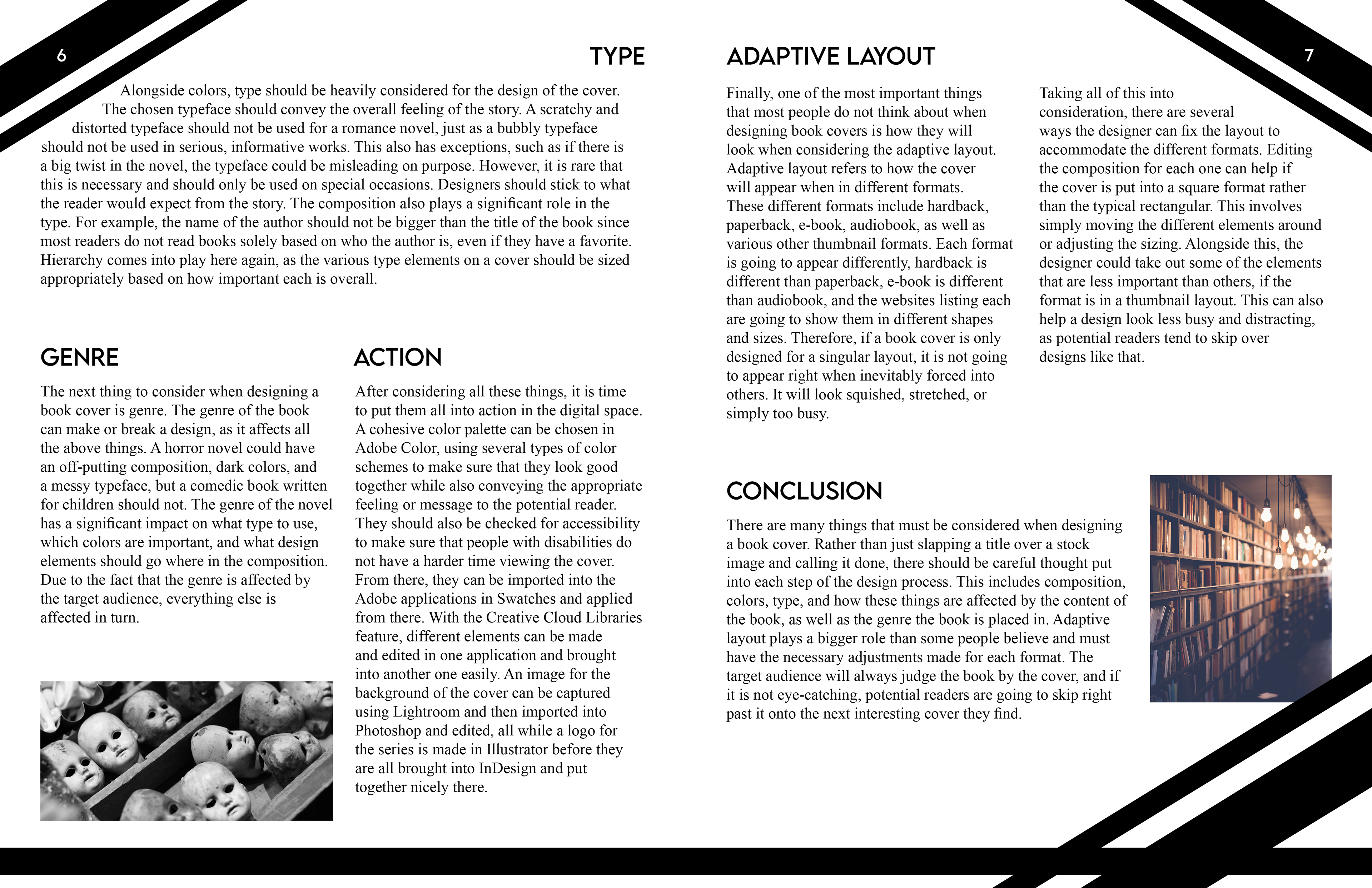
Design Brief: The topic chosen is Digital Design of book covers. The article is about all of the aspects that go into designing a book cover, including the typeface, genre, color, the content and themes of the book, the composition, and adaptive layout. The sidebar article talks about what colors mean and where those meanings came from. The overall design of the article layout was to represent books. The top corner of each page has diagonal lines to mimic people dog-earing book pages when reading to mark their place, which then sparked the entire layout to include this theme of diagonal lines. These diagonal lines can be seen not only on the page numbers but also in the pictures, with some of them being cut off at the corners or have lines cut through them. There are also large diagonal lines on the first and last page to get a better feel of the beginning and the end of the article. This diagonal line theme is also subtly included in the text placement, having some of the headers be right aligned towards the top of the page and left aligned towards the bottom, so there is an invisible diagonal line between them. The typefaces chosen were Lemon Milk because it fit with the diagonal lines, and Times New Roman because it is a common typeface used in books. The colors chosen for the article were just white and black so as not to distract from the rest of the colorful pictures, but the sidebar article has been inverted to have white text on a black background to separate it slightly from the rest of the article. The interactive elements are done almost entirely on the pictures, having a few of the images get larger as the mouse is hovered over them. However, two other images are interactive differently to evoke humor from the viewer, with the image of the goldfish at the start having a moustache when the mouse is hovered over it, and the image of the doll heads getting larger and zooming in on one of the faces as the mouse is hovered over it.
Flats


Interactive Layout QR
Cover and Mockup