Design Objective: Design packaging and branding for a fake juice company. Design a logo and an accompanying style guide. Design the packaging of the juice containers and make mockups of the final product. Make a case study including all branding, social media posts, website layout, emails, and all marketing. Design duotone postcards that would be sent to customers with a promotion.
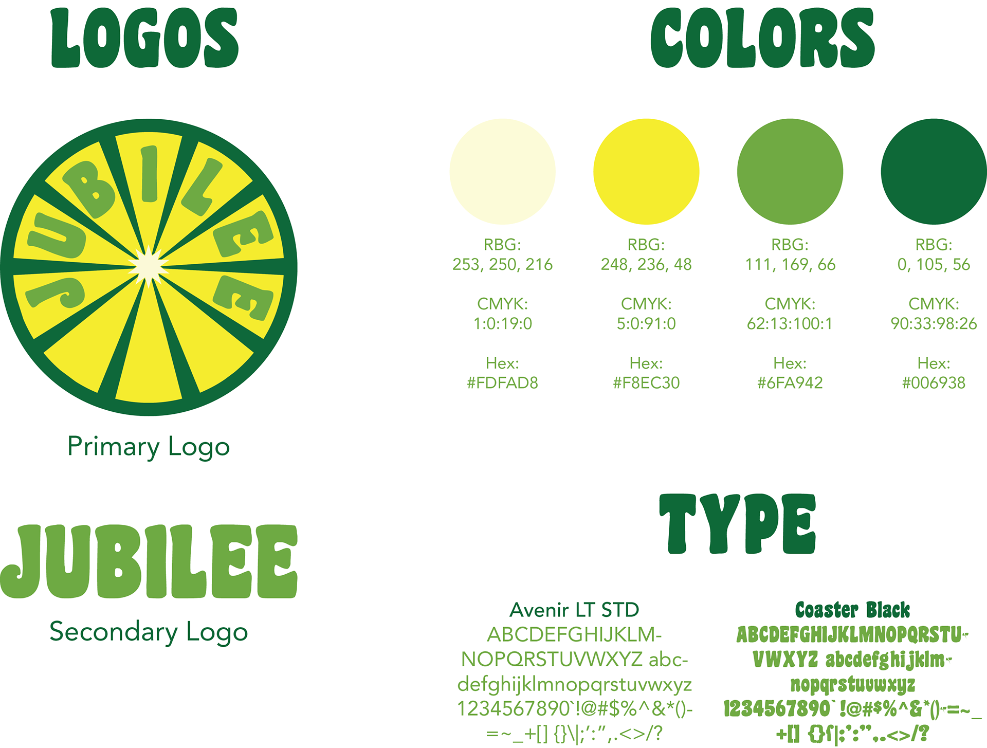
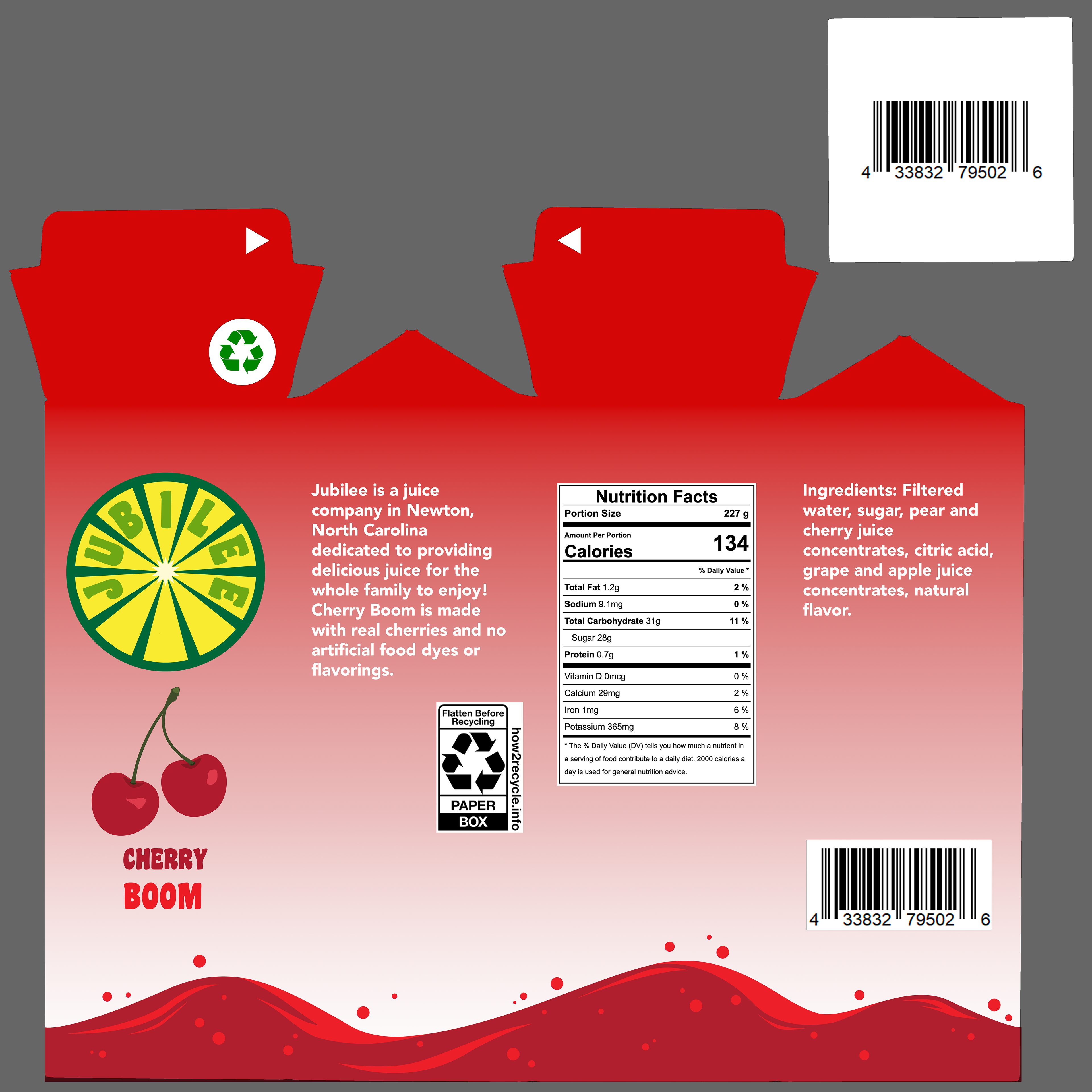
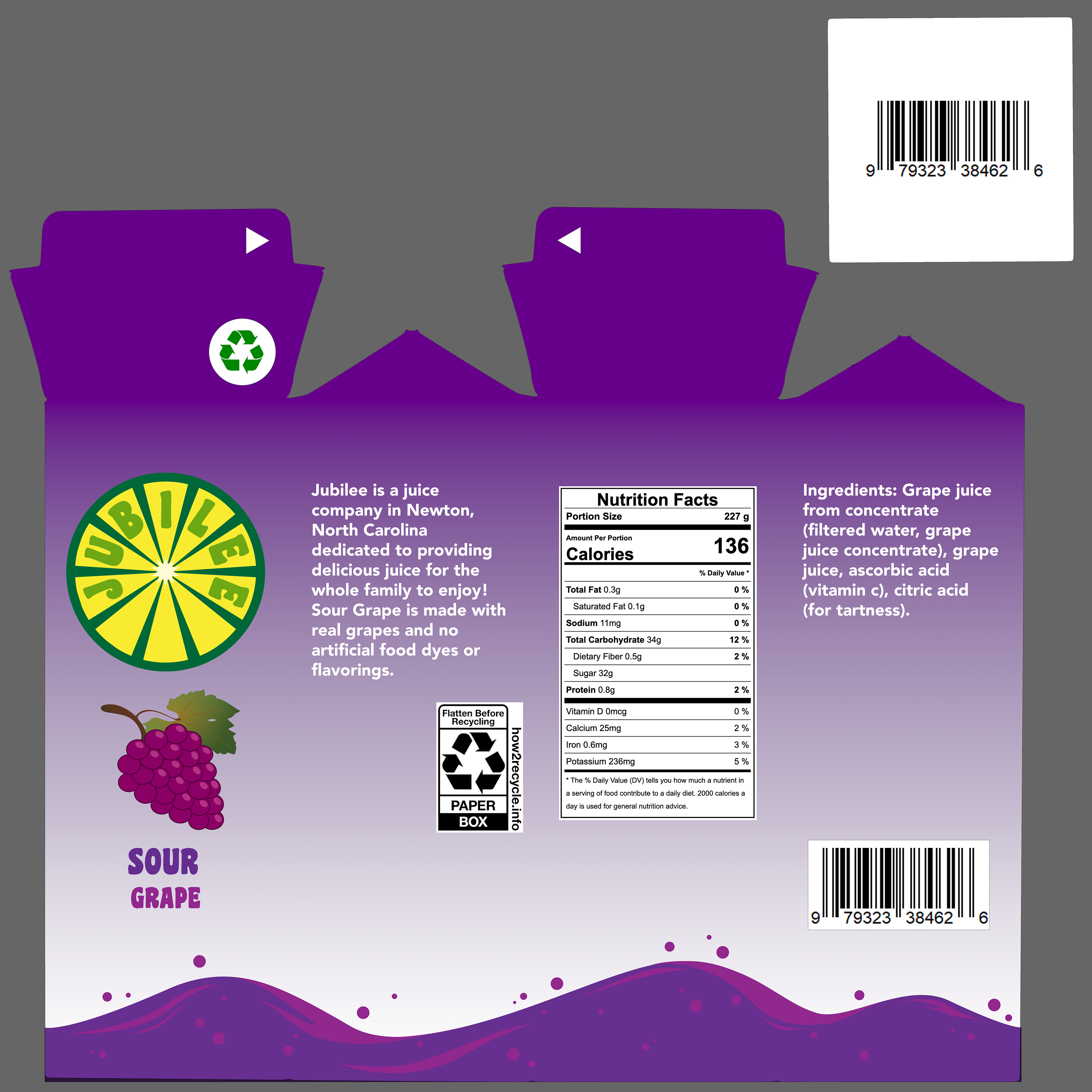
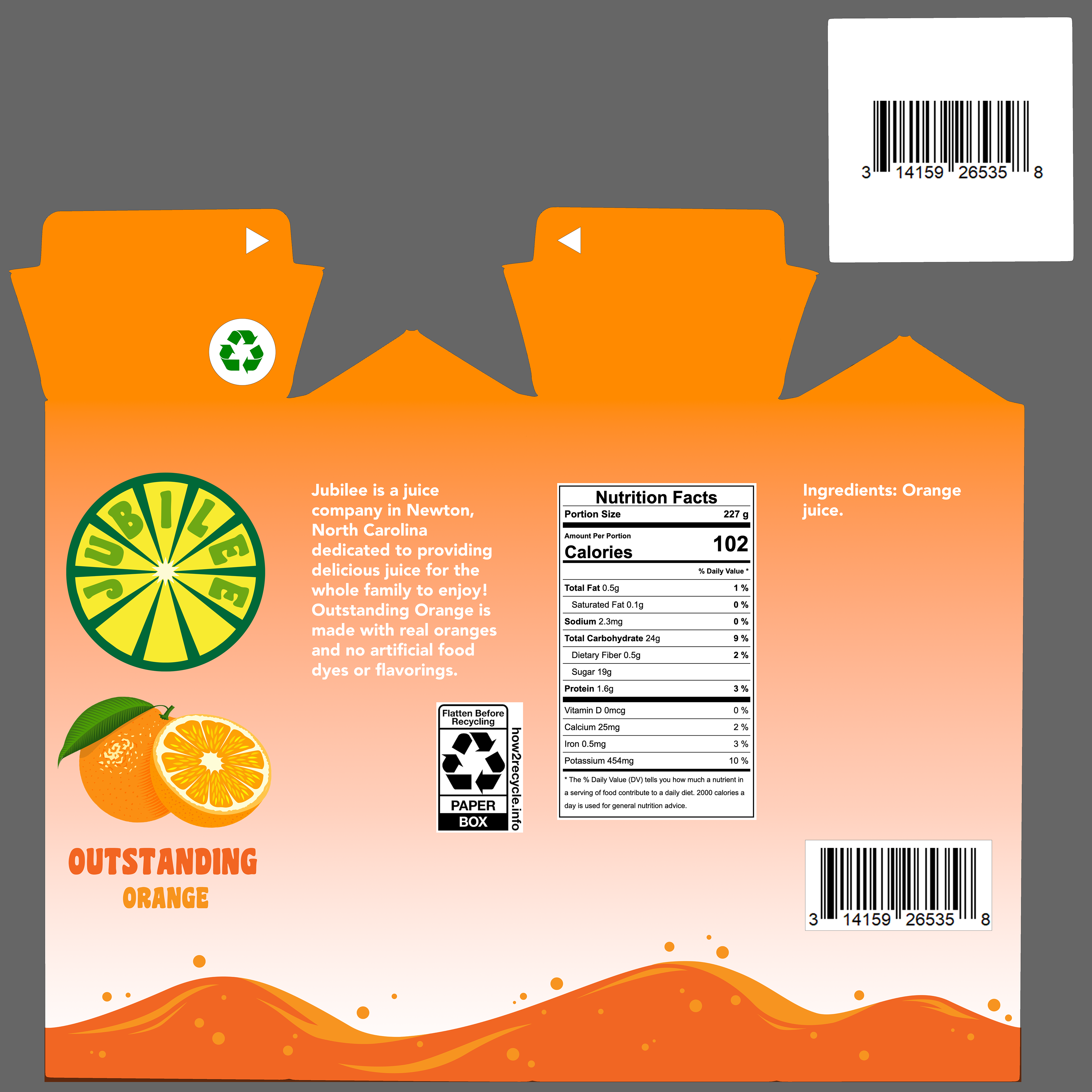
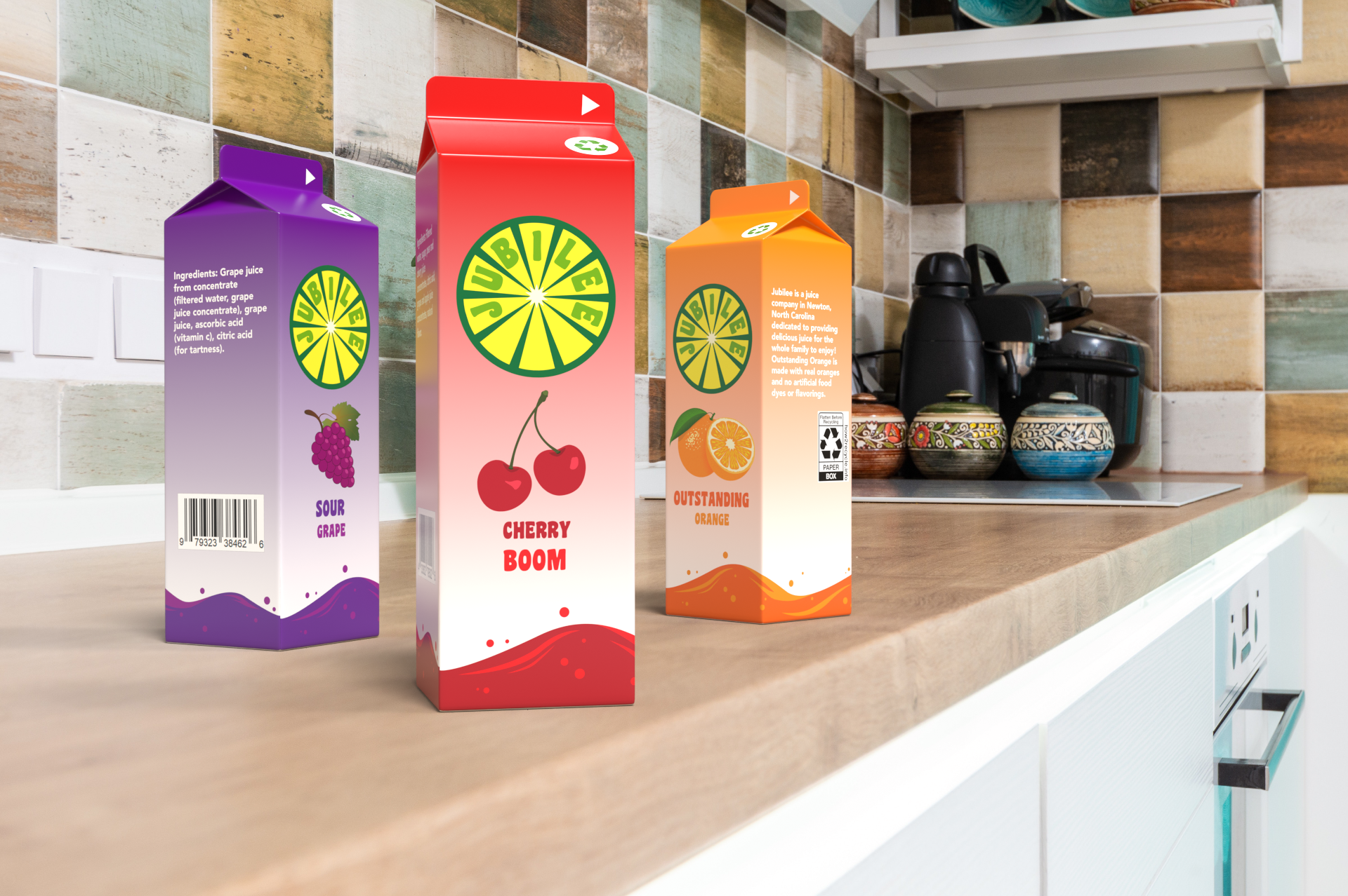
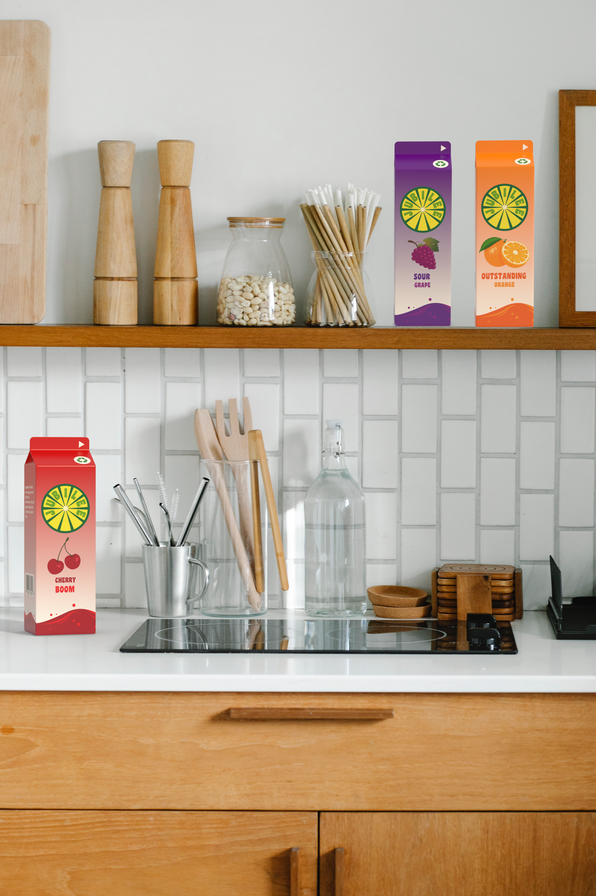
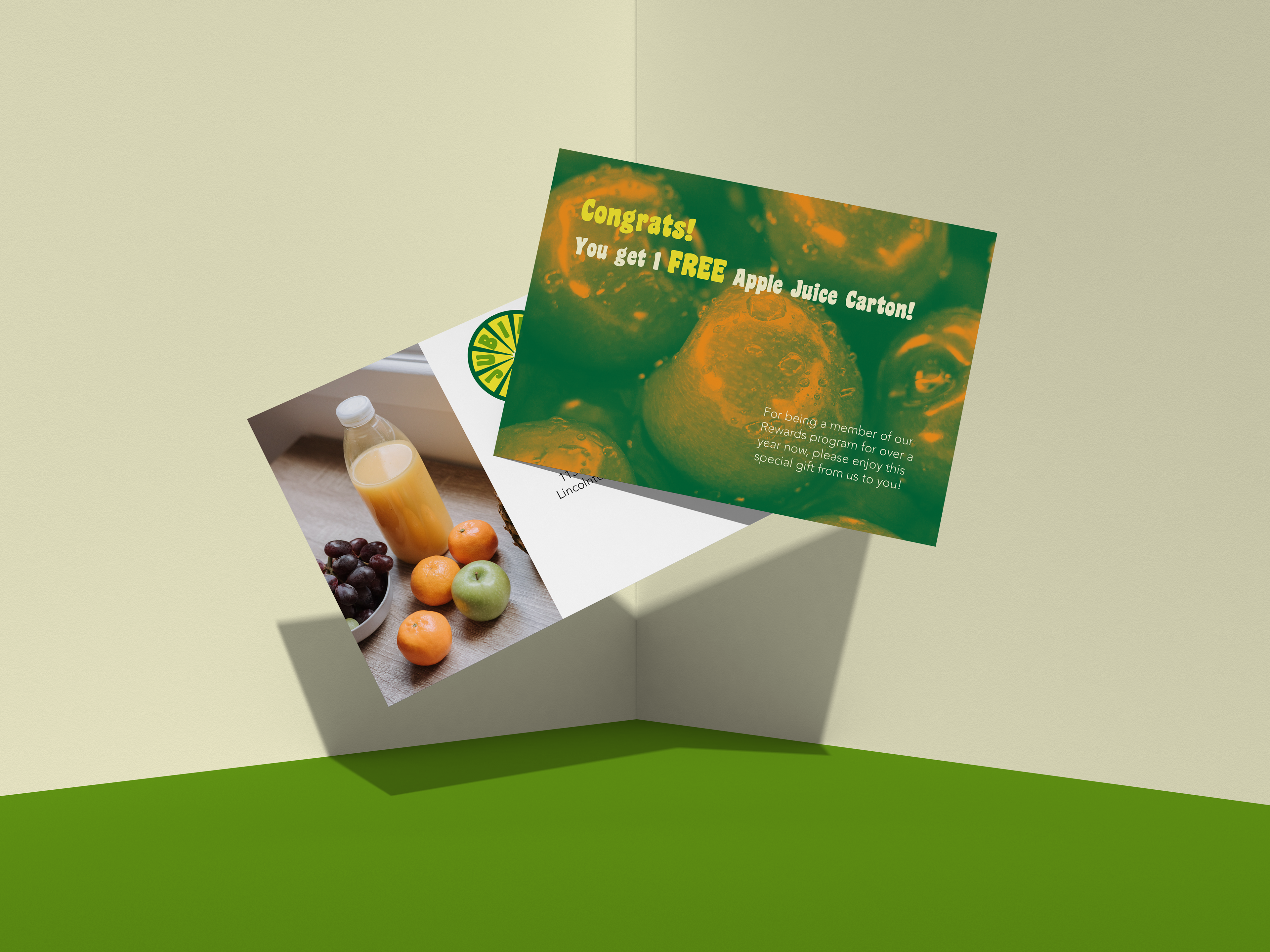
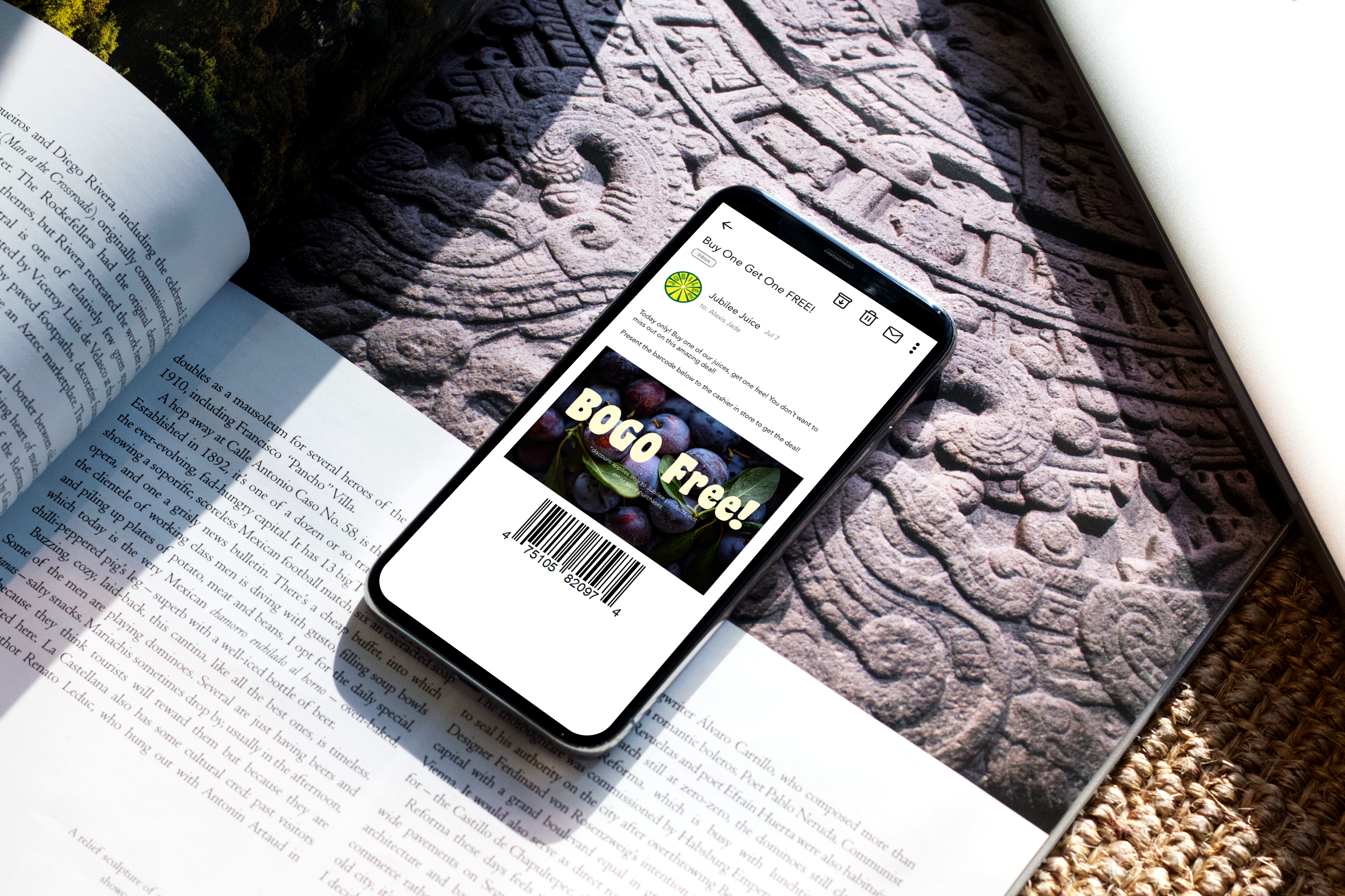
Design Brief: The logo for Jubilee is of a green and yellow fruit with the word Jubilee between the slices. This is because it automatically conveys that this is a juice company, and the colors convey a sense of freshness. Jubilee Juice was designed to appeal to both parents and children, so the packaging is very simple but still fun and colorful with gradients and fun patterns to grab the viewer’s eye and stand out from the rest on grocery store shelves. This same idea was applied to the rest of the branding, including the website, emails, social media posts, and marketing with bright colors and an overall feeling of fun. The postcards were designed as duotones, using a green from the main Jubilee logo and an orange from the orange juice carton design, as those were the colors that worked best together on the chosen pictures.
Logo Style Guide
Packaging Flats
Packaging Mockups
Postcard
Email and GIF

Digital Marketing Case Study